PSF 120th ANNIVERSARY LOGO
CONTRACT GRAPHIC DESIGN FOR PSF MECHANICAL, INC.
PSF Mechanical celebrated its 120th anniversary in 2018. To mark the occasion, a special anniversary logo was requested. The client was adamant that the existing PSF Mechanical logo be included within the anniversary logo. This presented a challenge. In order to be effective, a logo needs to be simple, and a logo within a logo is a lot of information to try to convey in a simple design. We went through many rounds of ideas trying to get at something that felt right to the client. I’m very happy with the sophisticated globe-like design that we eventually arrived at.
DESIGN PROCESS:
ROUND 1
DESIGN PROCESS:
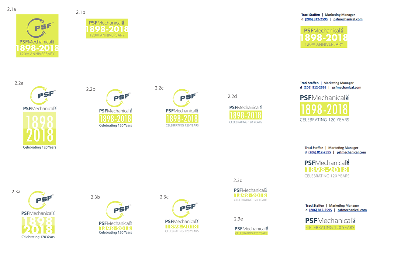
ROUND 2
Feedback on last round: “We need to see the full PSF logotype in the logo. We also need something that will work well in email signatures.”
DESIGN PROCESS:
ROUND 3
Feedback on last round: “It should feel more special, dynamic, and differentiated from our standard logo. Try using other colors besides the main brand colors. Experiment with our secondary brand colors.” (I also ask if it’s ok to use just the full company name, rather than the logotype, and the client says yes. That opens up a lot of options!)
DESIGN PROCESS:
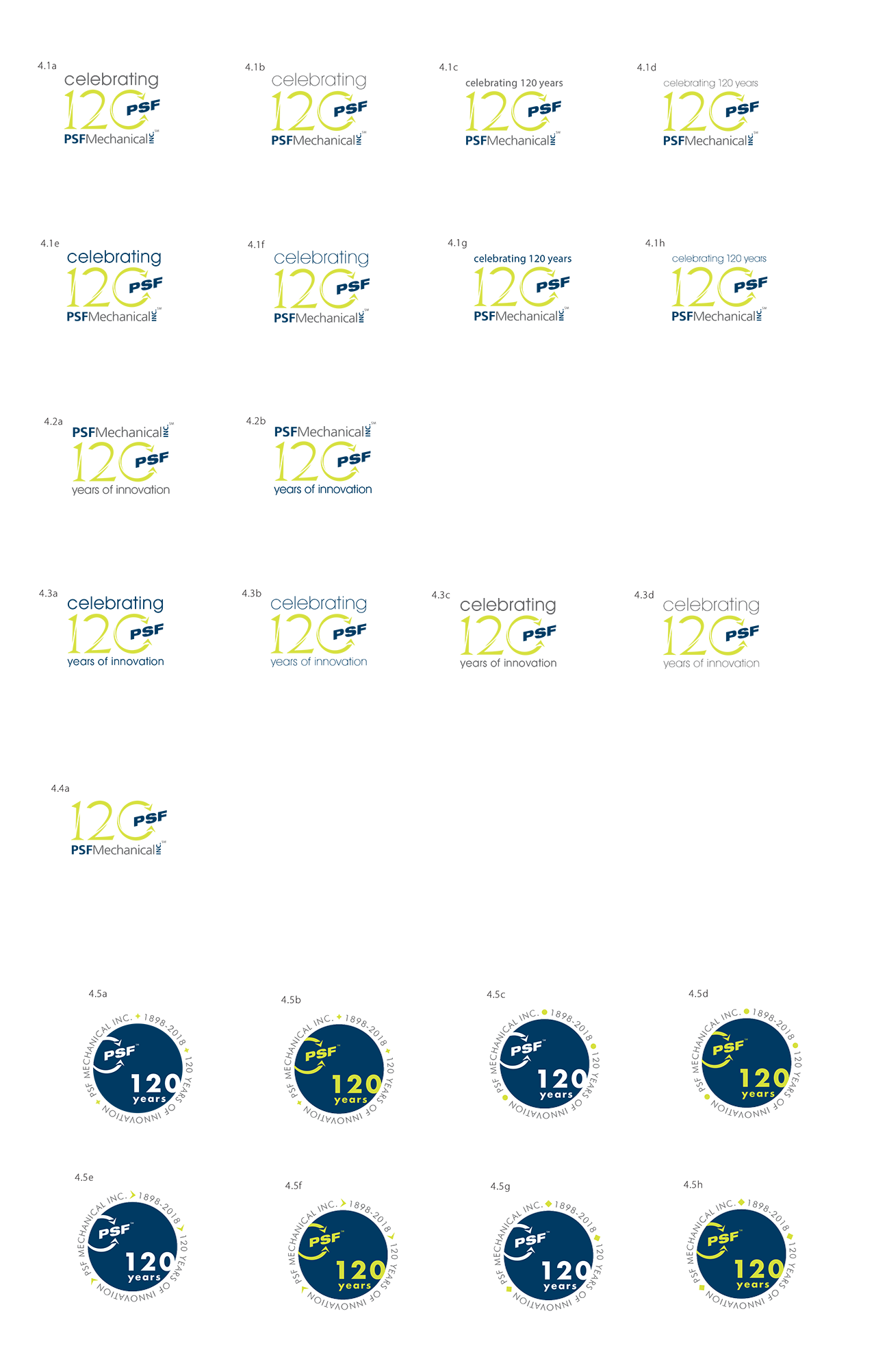
ROUND 4
The client was drawn to 3.1 and 3.8a from the last round. In the next round I continue to explore both paths.
DESIGN PROCESS:
ROUND 5
The client narrows down which circular designs are preferred, but wants to keep all of the numeral-focused designs on the table for their final review with a broader internal audience.
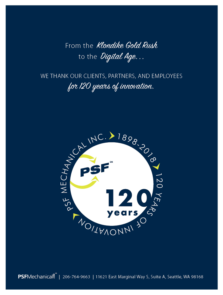
FINAL DESIGN:
4.5j is chosen as the final design. I create a white background version and a navy background version.


